Background
Kajima and Low Carbon Alliance had an existing relationship working together to deliver individual projects. This collaborative partnership soon led to the idea of a joint venture that could disrupt the renewables sector.
The renewable energy market is more alive than ever with an increasing number of organisations entering the industry, with the pressing need to develop renewable sources, due to the UK Government’s commitment to achieving Net Zero by 2050.
Although this had been relatively saturated within recent times, this didn’t deter the drive of both teams at Kajima and Low Carbon Alliance.
Kajima’s expertise lies in a high-level understanding of the delivery of large scale, sensitively-planned renewable projects and unrivalled knowledge of working within the public sector, whilst LCA bring an excellent reputation and market knowledge in the renewable energy market landscape.
Together they are Taiyo.
Approach
The Kajima and LCA teams both understood the importance and value in working through the necessary steps in order to create an identity which would mirror their vision, position and purpose for the Taiyo brand.
As the joint venture was relatively new, this provided an absolute clean slate to start the project with.
We began by working closely with the stakeholder group to tease out the nuances of why and what the brand stood for. This was done through a brand definition piece that allowed us to examine the purpose, vision, values, position and promise of Taiyo and offered the insight and understanding to then begin to build the identity from.
This then fed into a phase of moodboard exploration which helped define the desired look and feel for the brand’s visual language.
Delivery
The name for the brand had already been agreed prior to the start of the project. Taiyo, meaning “Sun” in Japanese, drew inspiration from the Eastern Asian heritage of Kajima and embodied the overarching essence of the joint venture.
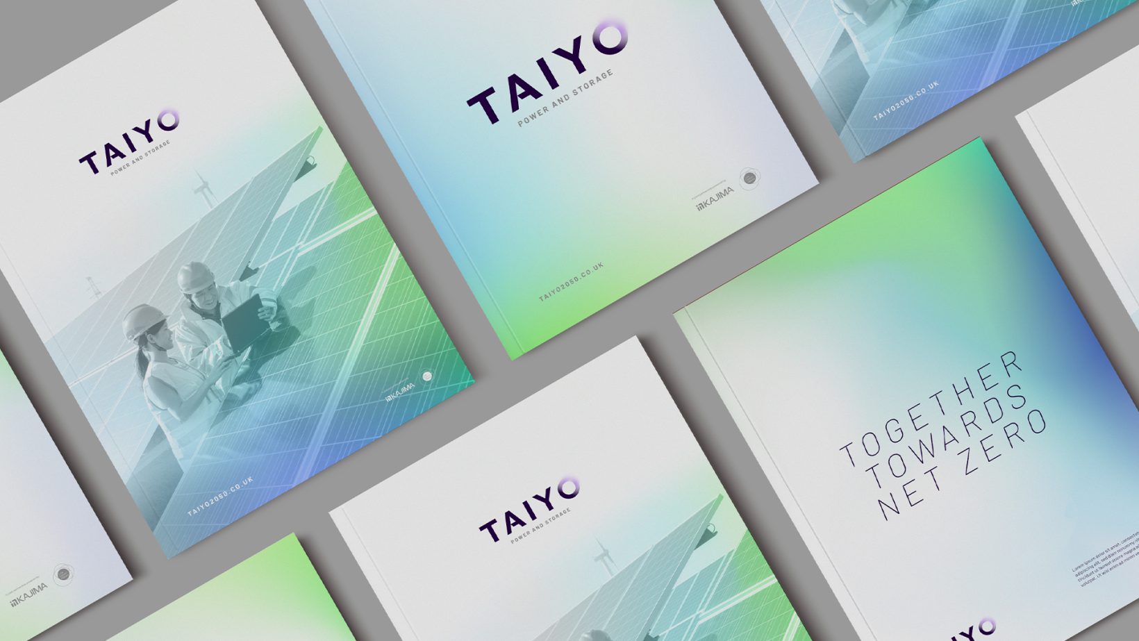
Building on the chosen name and the insights found within brand definition, an identity was developed that would mirror the distinctive approach of the organisation, whilst positioning Taiyo as a serious player within the industry, with a key consideration of creating a look and feel that could resonate across a wide range of audience types, from community groups and landowners to prospective corporate partners.
Drawing further inspiration from minimalist Japanese design styles, clear white space was utilised with flashes of colour to evoke a sense of energy, light and openness. This was strengthened with a combination of contrasting colours, which together, reflect the partnership of both organisations.
The concept of this “light and shade” was also worked into the “O” character within the logotype which is represented in the form of an eclipse style graphic, made up of two core elements, which come together as one to radiate a positive energy/light.
A recognisable brand identity was produced and delivered across a variety of primary touchpoints such as website and supporting launch materials.

The support from the Intimation team has been very valuable in ensuring we created the right brand and website to reflect all of our ambitions for Taiyo – I believe we have managed to achieve that.
Find out more about the Taiyo joint venture by visiting their website here.