
Ping Insure had managed to create a space for themselves within an increasingly competitive and saturated market place.
The organisation was now looking to branch out through a broader service offering and capture a wider audience range, knowing that their existing brand identity was outdated and no longer reflected the vision of the brand moving forward.
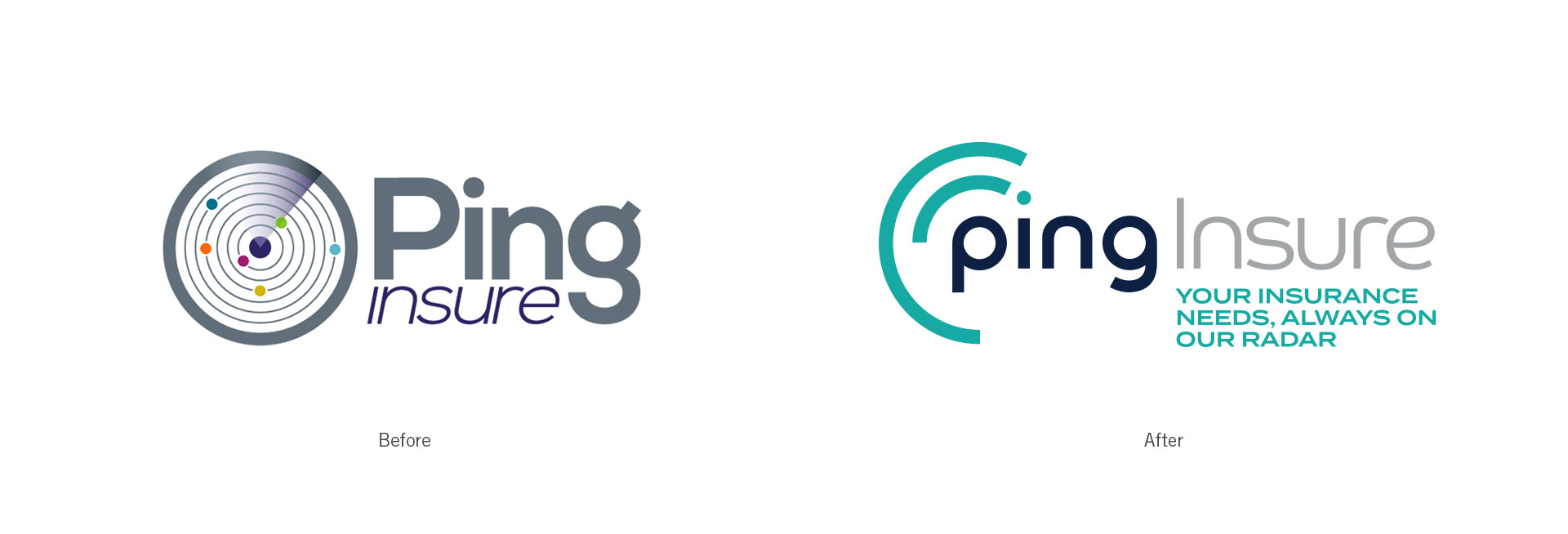
The previous branding had become outdated and was far too intricate for use across their primary digital touchpoints.
Background
The key stakeholders involved had a big ambition to build on the platform that they had developed within the insurance sector through the Ping brand and offering.
As an existing client of ours, the relationship had been built up over a number of years. This opened up a natural conversation with the client regarding the number of these changes they had in mind for their services which then led to a bigger conversation around the overall branding, look and feel.
Approach
As the offering was changing; which in turn would open the Ping brand up to a range of new audiences; it was agreed that the existing identity would no longer be effective in achieving the future goals of the organisation.
It was found that there was equity within the name and current branding as it stood which led us onto the path of developing the foundation of what already existed, into a more modern and inclusive identity that would align with the overarching aims of the business.
Delivery
Using the existing concept of the radar graphic, we developed and evolved this into a simplified take on the current logo.
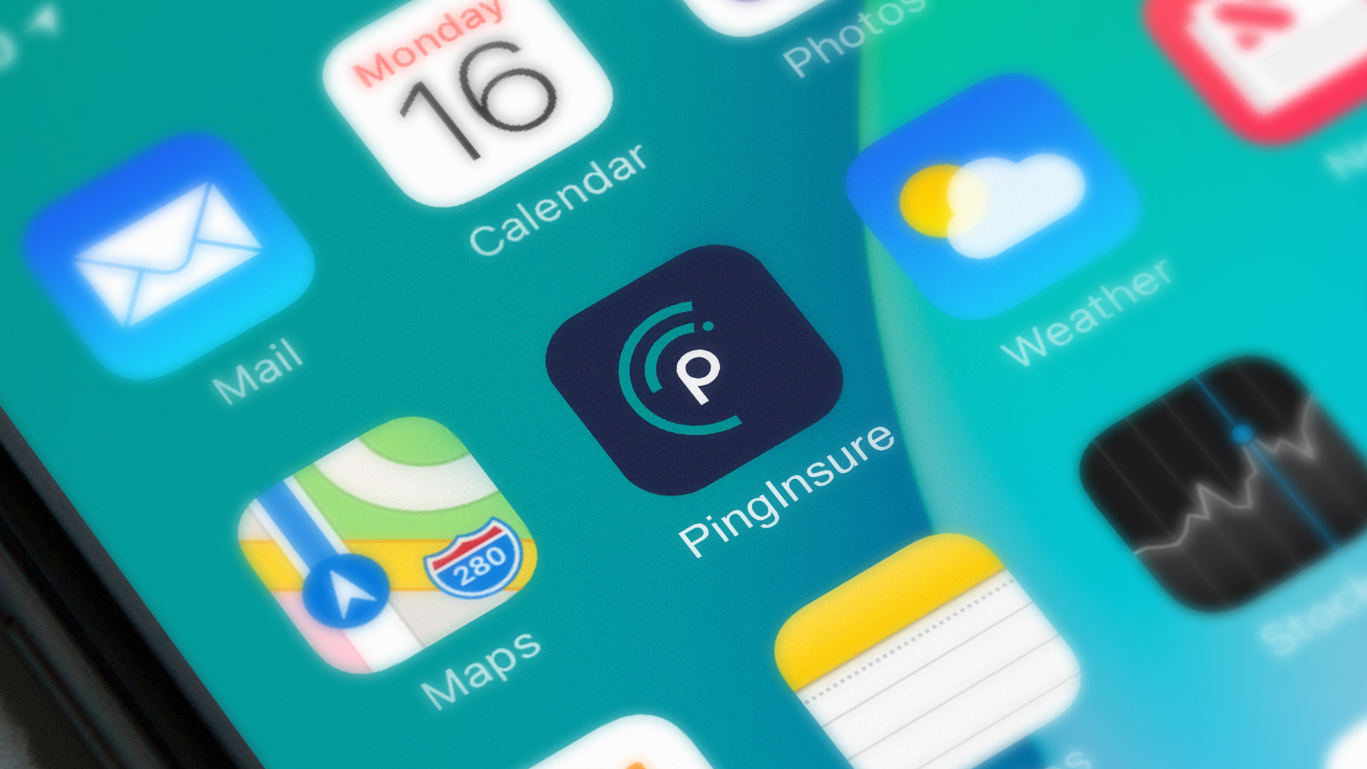
The new stripped back version of the logo mark provided more legibility within small scale usage across websites and social media channels, as well as offering a contemporary theme for the overall brand identity.
The “radar” device was built around the word mark itself which then gave us a simple yet impactful favicon graphic for use on primary touchpoints.
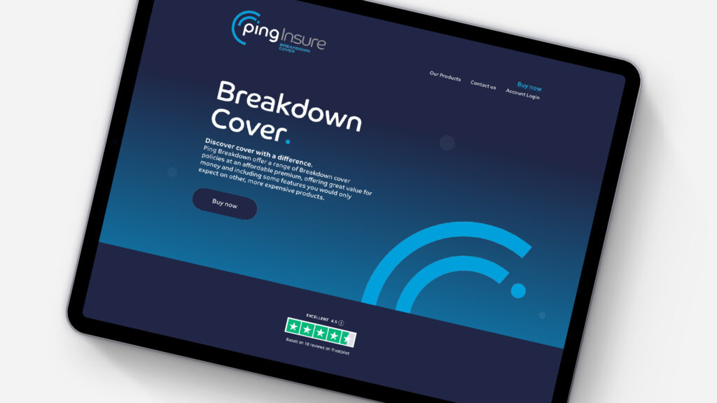
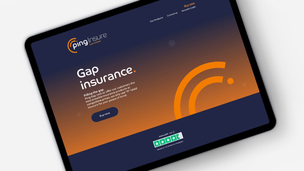
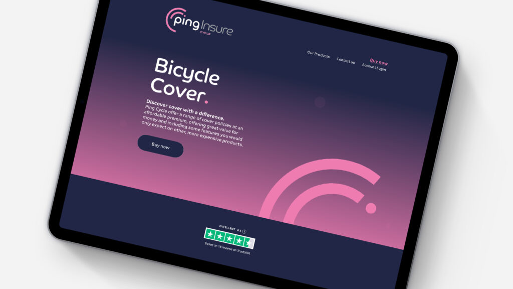
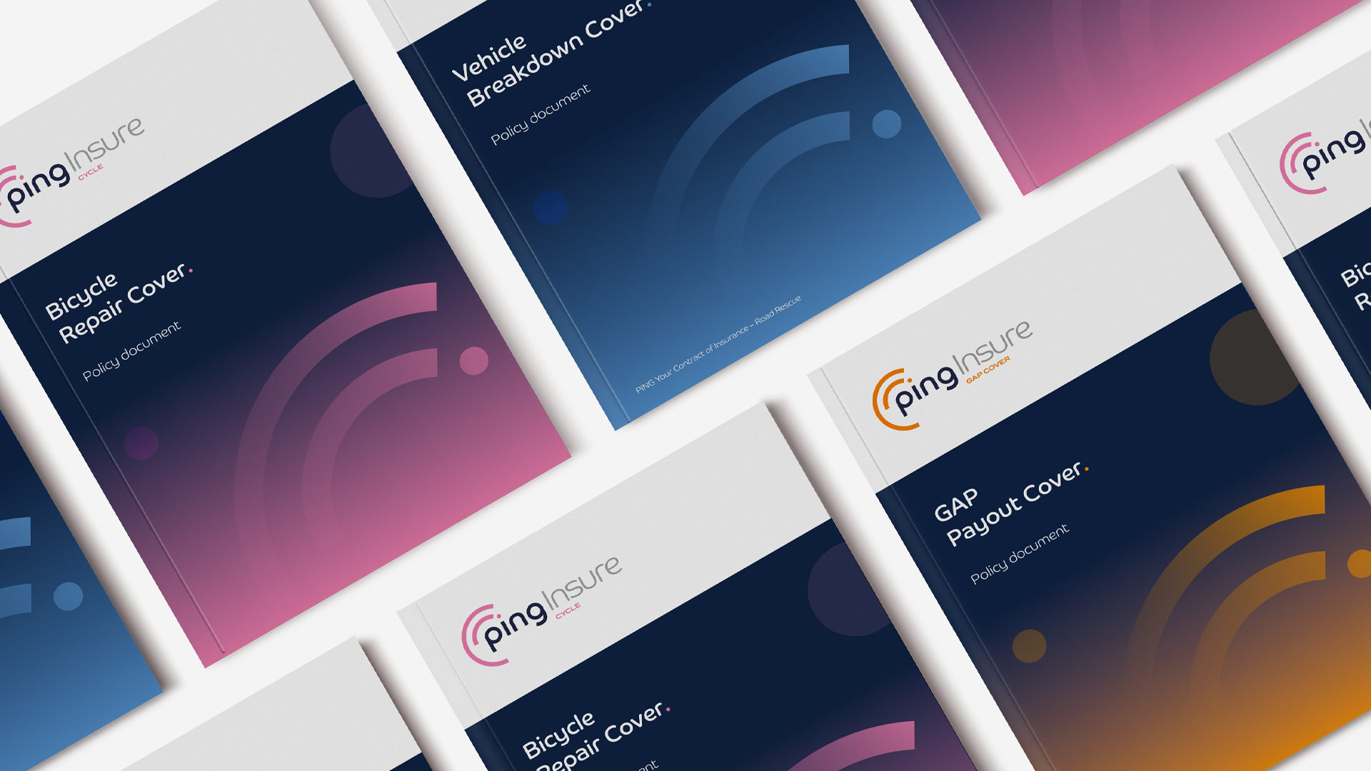
Once the overarching theme of the identity was agreed upon, it was then applied throughout all of the Ping sub brands and services, each being allocated an accent colour to act as an identifier across the family of products.
The new branding has since been rolled out across a number of product websites which included a full interface reskin to simplify and refine the interface for a more streamline user experience.
For more information on Ping Insure and their product offering, visit their website here.